Another week of COVID19 data and another set of updated visuals:
Historical trends across Ontario for cumulative reported cases, deaths and resolved cases on the DUG shiny dashboard, developed and maintained by @GregRousell https://gregrousell.shinyapps.io/COVID-19/

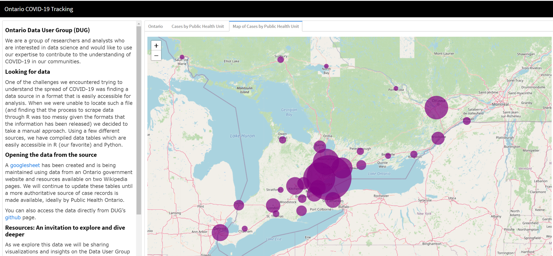
Provincial map of Regional COVID19 reported by Public Health Unit (PHU) on the DUG shiny dashboard. https://gregrousell.shinyapps.io/COVID-19/
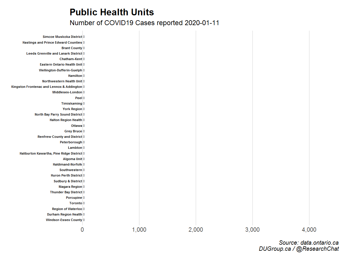
Animation of the cumulative number of daily cases reported by Public Health Unit (PHU), @ResearchChat
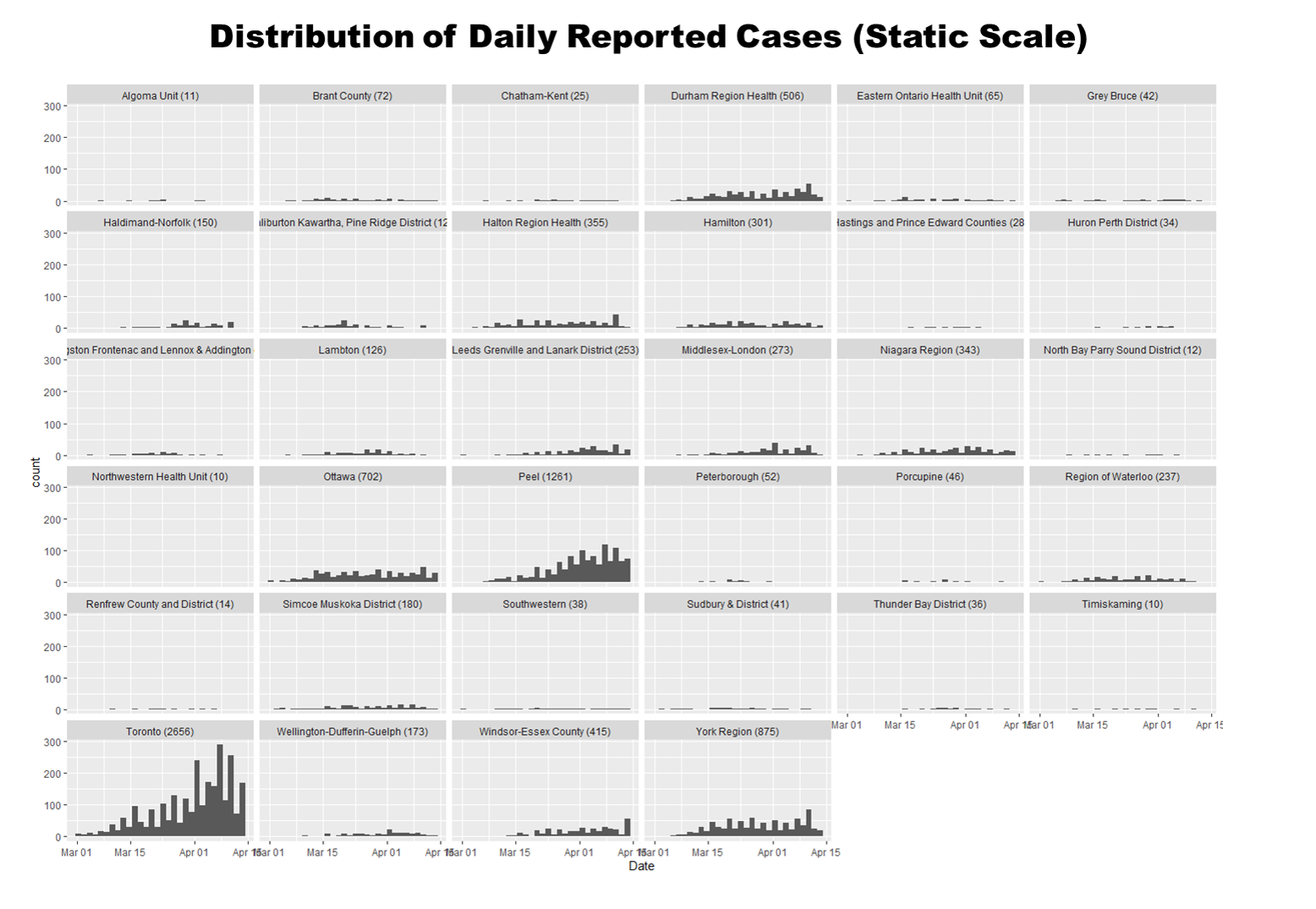
Plot of the daily cases using a static scale. This lets you see the scope of the daily cases relative to the other PHUs. Since Toronto has so many cases, the other PHU distributions are difficult to see. This is useful to see the magnitude of the reported cases across PHUs.
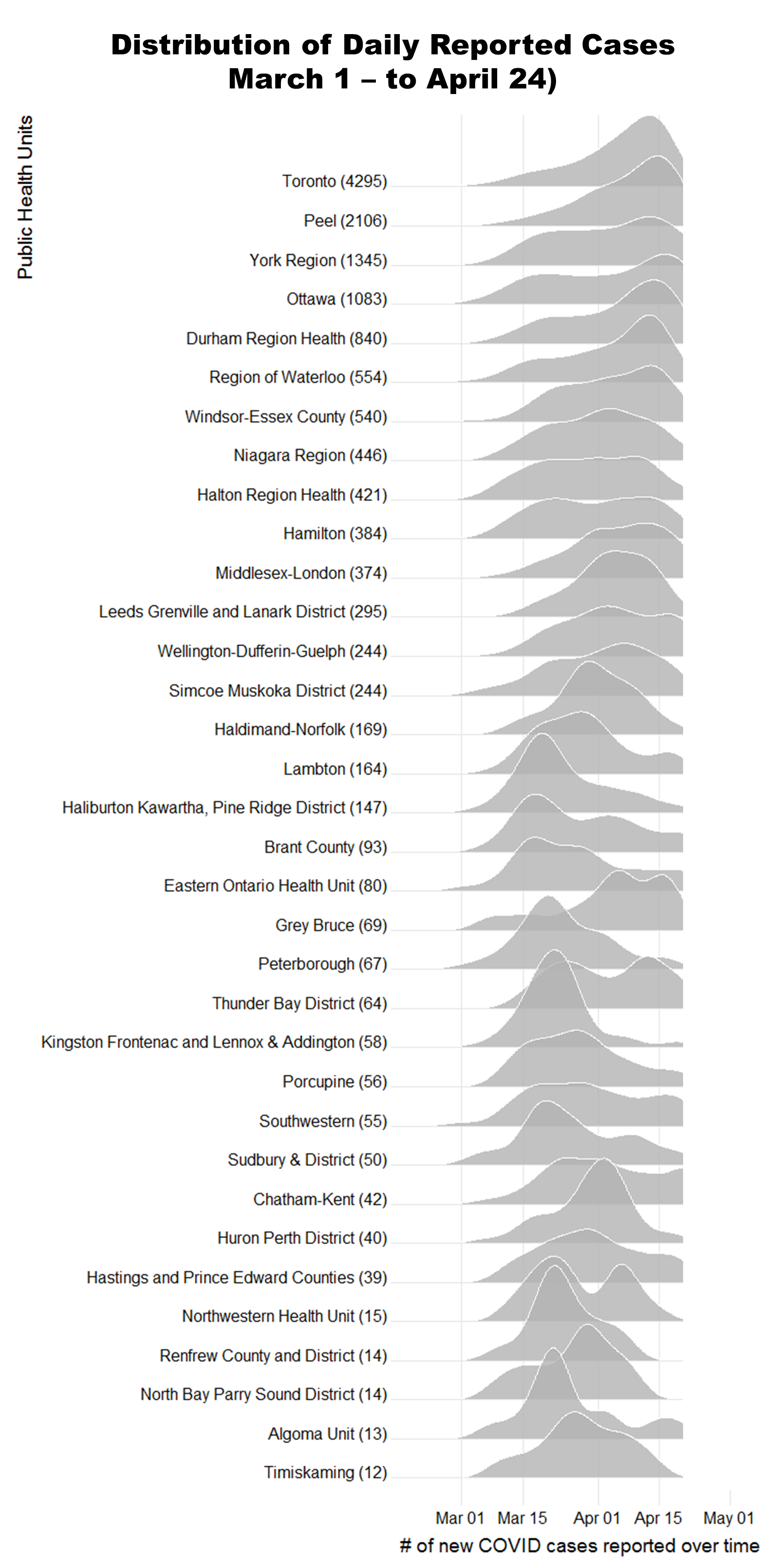
 Plot of the daily cases using a dynamic scale and smoothing. This lets you see the shape of the daily cases relative to other PHUs. Some had most of their cases reported early and have few cases reported subsequently (for example Kawartha Pine Ridge and Frontenac and Lennox & Addington), some have had steady increases (for example Toronto and Peel), some have had multiple spikes (bimodal distribution) in reported cases (for example Northwestern Health Unit).
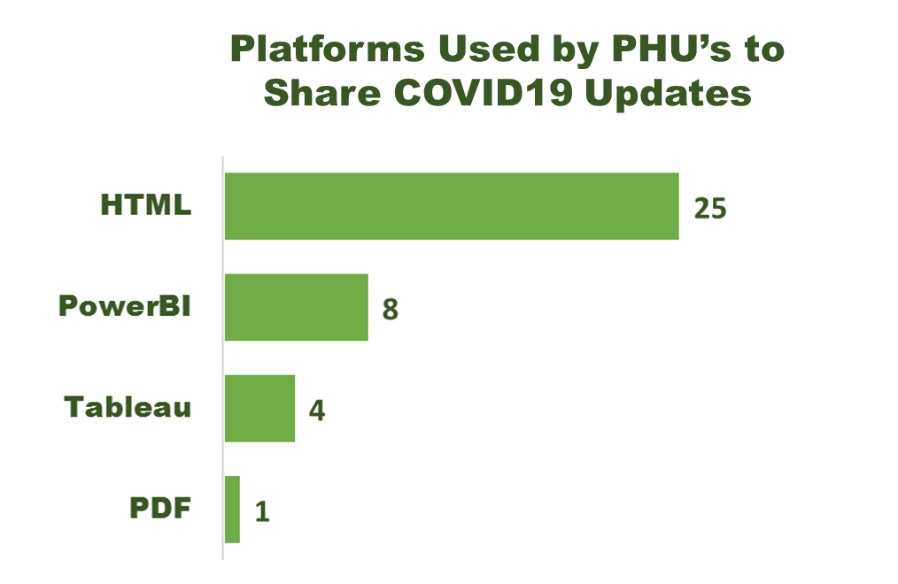
Although the majority of PHUs are reporting COVID19 statistics on their website as HTML text and tables, many are moving to Business Intelligence Tools such as PowerBI and Tableau.