
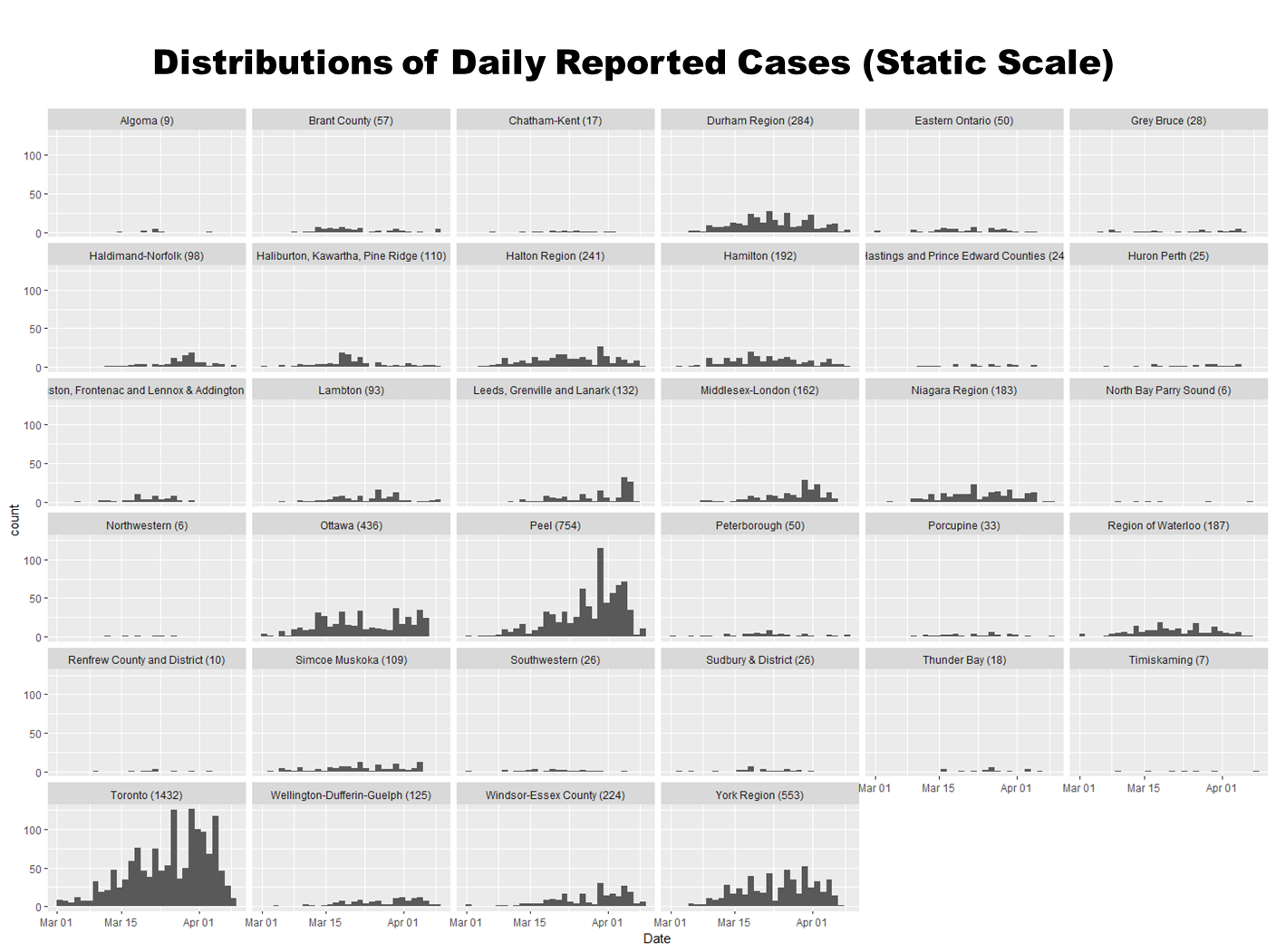
The same data can be viewed in a variety of ways to support different reflections and discussions. This histogram of the regional distributions of daily reported cases of COVID19 helps you appreciate the volume of cases that the Toronto and Peel Health Units are dealing with…
Whereas this ridgeline plot uses a “free scale”, making the shape of the non-GTA distributions easier to see and consider. Toronto has had a relatively steady increase in the daily reported cases of COVID19. Reported cases for other regions, on the other hand, return more sporadically. This speaks to a variety of considerations including testing capacity, travellers returning home etc.

